Whitespace as a Design Element: Less Really Is More
Whitespace isn’t empty—it’s intentional. Learn how breathing room improves readability and creates visual hierarchy without cluttering your layout.
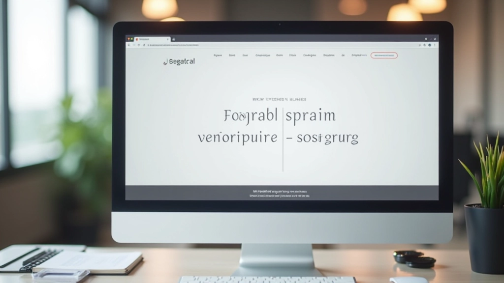
Read ArticleUnderstanding how to combine typefaces creates visual interest while maintaining readability. We break down serif, sans-serif, and display fonts with practical examples.
Typography isn’t just about picking fonts that look nice. It’s about creating a visual language that guides your visitors through your content. The right pairing can make a website feel intentional, professional, and trustworthy. The wrong one? Well, it’ll feel like someone threw darts at a font menu.
Here’s the thing—most websites use way too many fonts. We’ve all seen sites with three, four, sometimes five different typefaces competing for attention. It’s chaotic. The best sites? They’re usually built on just two fonts working in harmony. One for headings, one for body text. Simple, clean, effective.
Before you can pair fonts effectively, you need to understand what you’re working with. Fonts fall into distinct categories, and knowing the difference between them is half the battle.
Clean lines, no decorative strokes. Think Helvetica, Arial, Open Sans. They’re modern, readable on screens, and work beautifully for body text. Most websites default to sans-serif for good reason—they’re reliable and approachable.
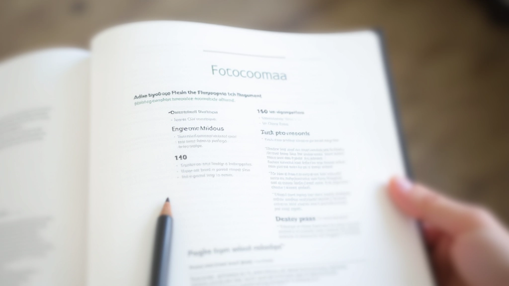
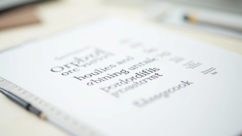
Those little feet at the ends of letters. Georgia, Garamond, Playfair Display. Serifs feel traditional, sophisticated, sometimes editorial. They work great for headings or hero statements. Body text in serif? It can work, but most readers prefer sans-serif for long passages.
The bold personalities. These are statement fonts—decorative, unique, memorable. Use them sparingly, usually just for main headlines. Never for body text. They’re meant to grab attention, not sustain it.
You don’t need to reinvent the wheel. Some combinations have proven themselves time and again. They’re classic for a reason.
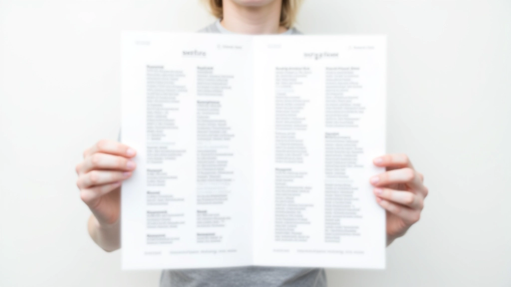
The most reliable approach. Use a serif for headings (Garamond, Merriweather, Playfair Display) and a clean sans-serif for body text (Open Sans, Lato, Inter). This combination feels balanced—the serif adds personality, the sans-serif ensures readability.
Both fonts from the same family but different weights and styles. Pair a bold, geometric sans (Montserrat, Raleway) with a neutral body font (Inter, Roboto). The contrast comes from size and weight, not category. Feels modern and cohesive.
A bold display font for your hero statement paired with a sensible sans-serif everywhere else. Works when you’ve got a strong visual statement to make. Just make sure that display font doesn’t overpower—use it sparingly.
The goal isn’t just to pick two fonts you like. It’s to create enough contrast that they feel intentional together, not accidental. Here’s what actually works:

Don’t judge fonts on a single word. Put them in context with actual paragraphs, multiple line lengths, different viewport sizes. How does that heading look when it wraps? Does the body text feel comfortable to read for 500 words?
A pairing that looks perfect on desktop might feel cramped on mobile. You’ll likely need different sizing for different screen sizes. Responsive typography isn’t optional—it’s essential.
You don’t need 50 font weights. Choose your heading font with 1-2 weights, your body font with 1 weight. Maybe add italic for emphasis. That’s it. Simplicity beats complexity every time.
A beautiful pairing that’s hard to read isn’t beautiful. Aim for 16px minimum for body text. Line-height between 1.5-1.8. Letter-spacing that feels natural, not cramped. Your visitors should never struggle to read your content.
Loading custom fonts adds weight to your site. Consider using system fonts (SF Pro, Segoe, Roboto) for body text. Save custom fonts for headings where the impact justifies the load time.
Look at sites you admire. Study their font choices. But don’t copy directly. Instead, understand *why* those fonts work together. Then apply that logic to your own project with your own font selections.
Good font pairing isn’t magic. It’s not about finding some obscure combination that nobody’s ever used. It’s about understanding the basics—category, contrast, and context—then making intentional choices.
“Typography is not just about picking fonts that look nice together. It’s about creating a visual system that guides your reader through your content effortlessly.”
Start with proven combinations. Test them thoroughly. Adjust for readability. Your visitors won’t consciously notice great typography, but they’ll definitely notice bad typography. That’s how you know you’ve got it right—when the fonts disappear and only the content remains.
The next time you’re building a website, don’t overthink it. Pick a solid sans-serif for body text. Choose a contrasting serif or display font for headings. Make sure there’s enough size and weight difference between them. Then move on to the other thousand things you need to get right. Typography is one piece of the puzzle, not the whole picture.

This article is an educational resource designed to help you understand font pairing principles. The recommendations and examples provided reflect best practices in web typography, but your specific needs may vary based on your brand, audience, and design goals. Font choices are subjective—what works beautifully for one site might not suit another. We encourage you to test all recommendations on your own projects before implementing them in production. Web accessibility standards (WCAG) should always be your priority when selecting and sizing fonts.