Choosing the Right Font Pairing for Your Website
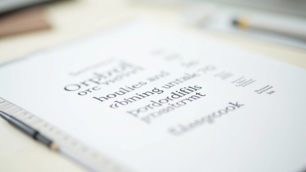
Understanding how to combine typefaces creates visual interest while maintaining readability. We break down serif, sans-serif, and display fonts with practical examples.
Read MoreLearn the principles of clean, purposeful design and master typography in the Canadian context. Discover how less becomes more when you understand the fundamentals.
Whether you’re starting from scratch or refining your skills, we’ve gathered essential resources to help you create websites that communicate clearly without unnecessary complexity. Typography isn’t just about choosing fonts—it’s about creating hierarchy, readability, and visual harmony.

Explore practical articles about minimalist design principles, typography fundamentals, and web design best practices for Canadian audiences.
Understanding how to combine typefaces creates visual interest while maintaining readability. We break down serif, sans-serif, and display fonts with practical examples.
Read More
Whitespace isn’t empty—it’s intentional. Learn how breathing room improves readability, guides user attention, and creates a premium feel on any website.
Read More
Guide your visitors through your content using size, weight, color, and spacing. Discover how hierarchy alone can structure information without boxes or dividers.
Read More
Making text readable on mobile doesn’t mean using smaller fonts everywhere. Learn fluid typography techniques that maintain readability and hierarchy at any screen size.
Read MoreEvery element serves a purpose. If something doesn’t improve the user experience or communicate a message, it doesn’t belong. This doesn’t mean boring—it means intentional.
With fewer elements, each one carries more weight. Strong contrast between text and background, between headings and body copy, creates visual interest and improves accessibility for all readers.
Type does more than convey words. It creates rhythm, establishes hierarchy, and sets the tone. In minimalist design, typography carries the entire visual load, so every choice matters.
Repeating the same typefaces, spacing patterns, and sizing across your site creates familiarity. Users learn where to look and what to expect, making navigation intuitive without extra help.
You don’t need to completely redesign your site overnight. Start small, focus on one element, and build from there.
Take a screenshot of your homepage. What elements don’t serve a purpose? What distracts from your main message? This is your starting point.
Pick one or two typefaces maximum. Define your sizes for headings, body text, and captions. Stick to these choices consistently across your entire site.
Gradually increase padding and margins. You’ll be surprised how much better content breathes when it has room. Your readers will thank you.
Check your design on mobile, tablet, and desktop. Make sure text is readable, hierarchy is clear, and the overall feel is professional and clean.